
-- Download The White Album as PDF --
It’s fresh and crisp, meditative and inspiring, sometimes cold, always tricky, and really hard to keep clean. White is the color du jour. But are you brave enough? By Gillian Drummond.

In a London townhouse, designer Charles Mellersh used white as a backdrop for colorful and vintage pieces. Photo by Chris Tubbs
When photographers Eric and Casia Fletcher moved into their studio space in a converted warehouse at 6th Avenue and 6th Street, a painted white wall spoke to them. First, it asked to be re-painted, from off-white to bright white. Next, it asked for more creativity.
The owners of Purple Nickel Studio got the idea for a series of white picture frames from a visit to Tucson’s Zinburger restaurant, where a row of mirrors on a white wall had a dramatic effect. “I was like, ‘That would be so awesome with frames, and to have tchotchkes and objects hanging in them’,” says Casia.

Purple Nickel’s white studio wall. Photo by Gillian Drummond
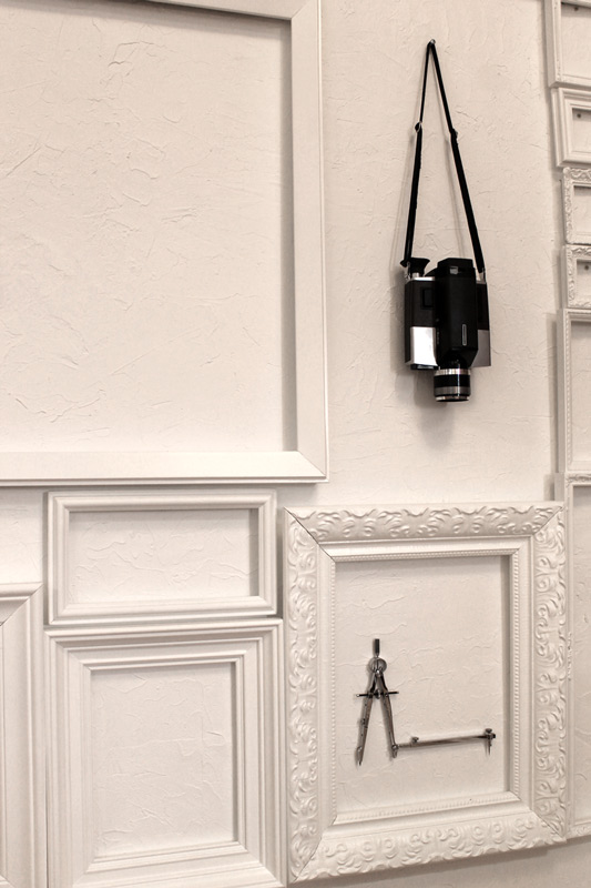
Purple Nickel’s owners chose to frame certain objects. Photo by Gillian Drummond
They found a selection of picture frames – in different sizes – at thrift stores, yard sales, sometimes antique stores. They also picked up a old screen door. Then they set up a temporary painting booth in their back yard and spray-painted the frames white.
Getting their hands on frames that would sit snugly up against one another, and making them fit, was “literally like a puzzle. It took me many nights to figure out,” says Eric, who placed the frames on the floor first.
Then the couple hung their ‘tchotchkes’ – although what they chose are hardly disposable, nor worthless. There is an old camera, an architect’s compass (from Eric’s time studying architecture), a stapler, a wooden game board, and more. The objects hang in the middle of select frames, becoming a piece of art.
“I like how it just became a texture. It’s like three-dimensional wallpaper,” says Eric of the effect.
White is, and has always been, a controversial choice for home décor: fresh and surprising, meditative, controversial, and with a love-it-or-hate-it sentiment – very much like The Beatles’ self-titled double album, which became known as The White Album.

The Notting Hill kitchen, by Charles Mellersh. Photo by Chris Tubbs
Those who use it encourage caution: they recommend good lighting, and contrast. The work of London architect Charles Mellersh at a Notting Hill townhouse is striking not because of the white, but because of the vintage furniture and objects that stand beside it.
“This was the first all-white interior I’ve undertaken and it was a leap of faith in many respects,” says Charles, formerly interiors editor at Wallpaper magazine. “I’m generally much fonder of darker and moodier hues. That said, the project has an almost dairy-like feel about it that feels remarkably warm.”
He broke up the white walls, carrera marble floors, marble counters and plain white wall tiles, with vintage and modern furniture and accessories and, in the case of the wall tiles, dark grout. The key, he says, was to instill warm through strong textures and considered furniture choices.
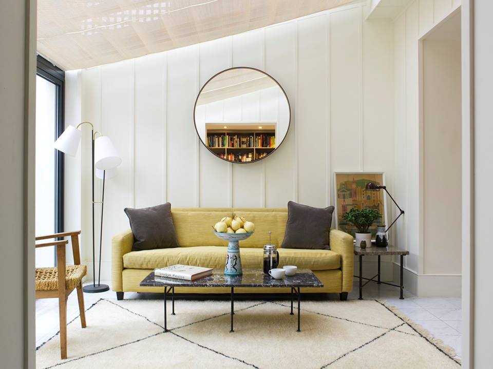
In the London townhouse, Charles Mellersh had panels put on the walls to add architectural interest. Photo by Chris Tubbs
At Sugar Sweet Bakery, which occupies a light-filled corner space at Tucson’s historic Broadway Village, owners Tina Owyoung and Don Scheer were persuaded by architect and construction company Repp McClain to go with something modern, and light in color.
The husband-and-wife team had been considering a darker, more traditional look to go with the previous space they eyed across the street. But the airy store space they ended up with, still with its original brown concrete floors, lent itself to lighter fixtures, says Tina.
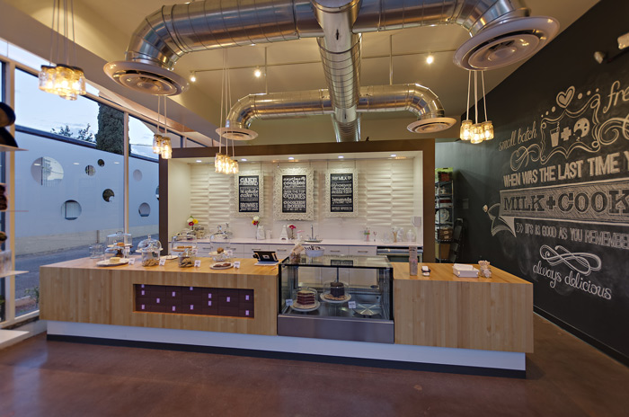
Sugar Sweet Bakery went all-white for its backsplash and main wall. Photo by Liam Frederick.

The chalkboards add contrast to a white wall at Sugar Sweet Bakery. Photo by Gillian Drummond
For the front entry space, in went white cabinets from IKEA, a white powder-coated metal part backsplash, and decorative panels from inhabit.com for the rest of the backsplash. The panels are made of bagasse, the fiber left over after juice has been squeezed out of sugarcane stalks, and a renewable resource. They come in an eggshell shade, can be painted, and can be recycled or composted after use. (Price: $86 for ten tiles that cover 22.5 sq ft).
To offset the white, there is a pale pink countertop of powder-coated metal, and a predominance of black chalkboard. Tina and Don, both former graphic designers, found ornate framed mirrors at Cost Plus World Market. Two were antiqued white, the other the couple painted themselves. They took out the mirrors and inserted chalkboard, which Don writes on free-style (in white chalk, naturally) to provide menus. One other chalkboard and white-lettered wall serves the same purpose.

Another wall at Sugar Sweet Bakery is all-black chalkboard paint. Photo by Gillian Drummond
Tucson interior designer Florencia Turco de Roussel blames white’s decor comeback in recent years on Swedish chain IKEA. “That’s when I fell in love with white all over again.”
Some might think an all-white decor is boring, says Florencia, who runs Within Studio. But the trick is to use it as a backdrop, and change up what’s around it: slipcovers, pillows, rugs. “It’s a great backdrop, especially if you have art.”

The mani-pedi area at Hush Salon. Photo by Christopher Bowden Photography LLC
When Florencia designed the interior of the new Hush salon and spa in Tucson, she suggested a pedicure area of white porcelain tile – set up a couple of steps from the floor – with a bright yellow vinyl cushion for the long bench seat. Not only did it make the area stand out from the “energetic, rock ‘n roll” look of the rest of the salon (reds and chocolates feature, a busy wallpaper, and light wood), it saved the client money. “People that come to me know I’m not going to be wasteful of their funds, so I try to use money accordingly. I said we’ll get inexpensive tile then a really good quality vinyl fabric for the cushions,” says Florencia.
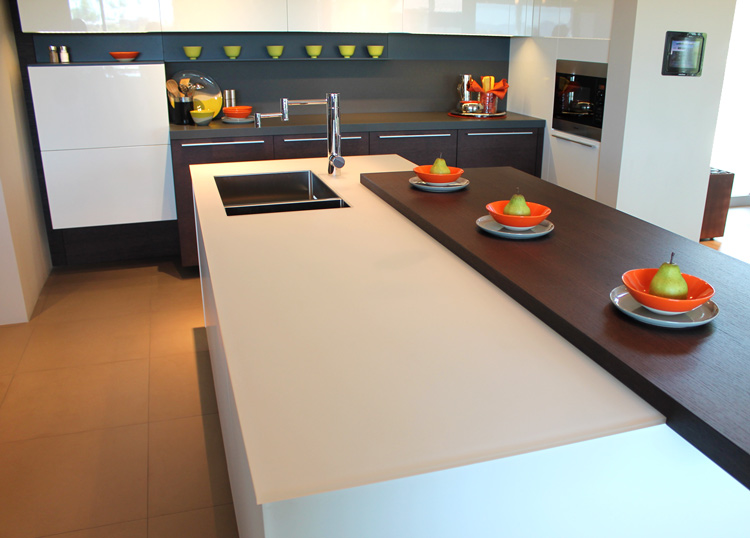
A kitchen island by Poliform features a contrast of brown oak. Photo by Gillian Drummond
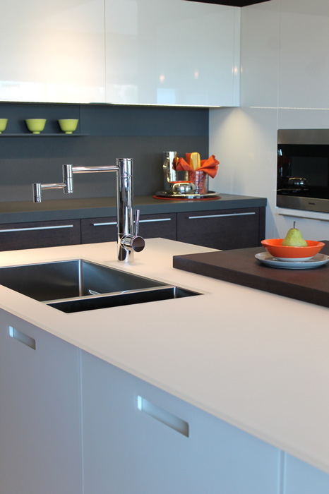
Poliform kitchen. Photo by Gillian Drummond
But while white makes a statement, all-white is not recommended, says Gillian Turney, interior designer with Kevin B. Howard Architects, which houses Tucson’s Poliform furniture showroom. “It creates a whitewash,” says Gillian.
Italian-based Poliform loves white, but also likes to compliment it with other textures or colors or both. So a kitchen island features white glass on the counter and cabinet doors, with a piece of brown oak alongside the glass counter. “It’s not about bling, it’s just the materials alone, whether they’re glossy, lacquered material next to brown oak or something else. It makes it pop out even more.”
White is controversial, says Gillian. “Everyone has an opinion about the color.” Her background in fine arts and auction houses taught her a little bit of the history of white. It began as a servants’ color, because whitewashing was an easy means of décor. Then it turned into a “nobleman’s color”, says Gillian, because it’s hard to keep clean.
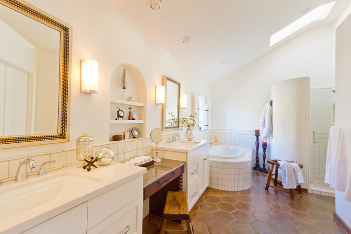
Kathryn Prideaux brought in different textures to break up the white bathroom. Photo courtesy of Prideaux Design
Kathryn Prideaux designed this client’s bathroom with an old world feel but clean aesthetic. Photo courtesy of Prideaux Design
“I love white on white, especially in a bathroom,” says Tucson interior and landscape designer Kathryn Prideaux of Prideaux Design. When some of her clients wanted an old-world feel for their Tucson townhome, but also a clean, simple aesthetic, Kathryn made sure to mix up the whites with different textures. She says to make sure you stick to the same ‘family’ of whites; some whites have a blue undertone, others pink, and so on. “The use of whites requires a lot of attention to detail in the hues and color undertones of the whites and how well they will mix. Having samples in hand of every finish is a must.”
Rough woods, wrought iron, a hexagon Saltillo tile, polished chrome and silver-leaf elements gave high contrast and different textures, says Kathryn.
Layering like this, say the designers we spoke to, not only creates visual interest but warms up what could otherwise be a cold, bare space.
Not only that, it makes the whole interior design process more exciting. A bit like The Beatles’ White Album itself, your room becomes a place to experiment and diversify.
* For more white decor ideas, see Boxhill’s products of the month in our Ground Floor column.
More white-on-white at the townhouse designed by Charles Mellersh. Photo by Chris Tubbs


Casia, you guys are so creative! that wall is too cool. Great piece Gillian, I’ll have to go try HUSH asap just because it looks so pretty. Good location for me too, and I didn’t know about it yet!